myClinton App

The time has finally come to put it all together.
From our initial ideation to wireframes, we are now able to create high-fidelity prototypes. But this step is big, and not as simple as designing our low-fidelity in Adobe XD or Figma, it takes a bit of planning.
Let’s take a closer look.
What are High-Fidelity Prototypes?
High-fidelity prototypes are when we take our initial prototypes, usually paper-prototypes or something similar, and translate that to a professional design software, building it like it was a real app.
Figma, a company that produces a software for prototyping, describes it as:
“…a polished simulation of your final product. Visual design details and real content show the look and feel of the end product. For testing, robust interactivity and functionality provide a more realistic user experience.”
The long and short of it, however, is that it is a way to create a prototype that looks exactly how you want the final app or product to look without actually developing it.
This is great; as for designers, it gives us a way to tweak things and build out how entire pages should look before developers ever have to do anything. Once we nail down our design, it gets passed on to developers (or if you’re on a one-man team, you get to do it yourself!).
But, if a high-fidelity prototype is like the final project, what is a medium-fidelity prototype?
Well, it’s like a mash between a low-fidelity prototype, like a paper prototype we created before, and a high-fidelity prototype. So, it may have some basic paper aspects like before, missing assets, and some basic designing done to show an idea rather than a final project.
Now that we know a bit about these prototypes let’s see how to make them.
Making High-Fidelity Prototypes
While we can just start making things now as we please, it helps first to choose a UI kit to follow. A UI kit is usually just a package of elements, like buttons, icons, typography, and more, that help you stay on brand and consistent throughout your prototype.
For this project, I will use Apple’s UI kit for iPhones, iPads, and other devices. You can download it here.
You can theoretically start from anywhere for projects like these, where you will make multiple screens and pages. I usually like starting from my home screen then building out from there, but wherever works best for you is where you should go.
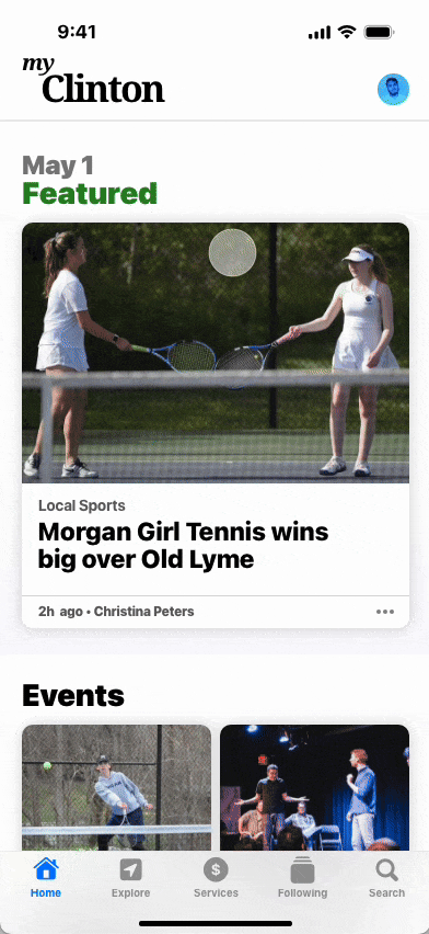
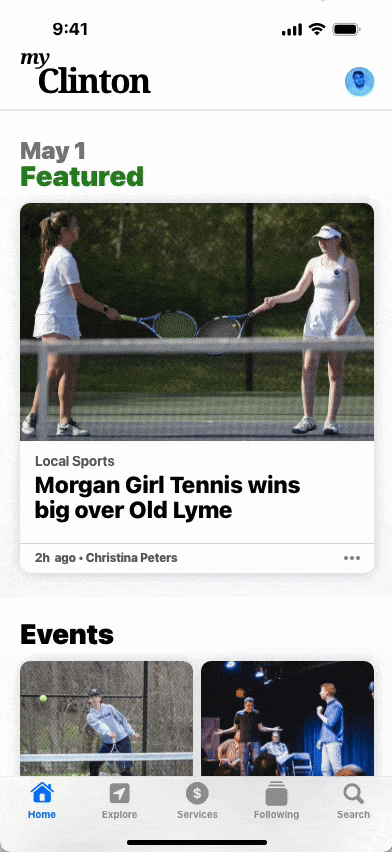
I then just start building out the components I need! I started with my header bar, creating my logo, and what I wanted the elements to look like. I also grabbed the iPhone top bar icons to make the header look more consistent to how it would be on an iPhone.

I really wanted this header to be simple, so by having just the logo and then the profile icon, I think it makes this top bar look clean and concise without too much noise.
For the logo, I used Noto Serif (one of my current favorite fonts), stacking the two elements near each other to make them look good.
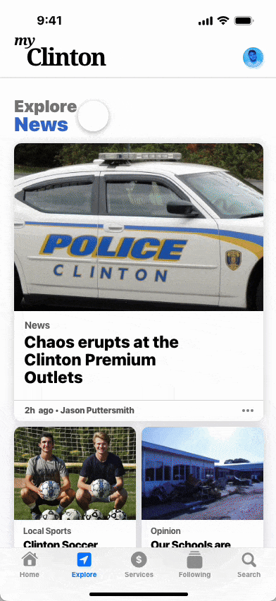
I then moved on to the body, where I started by making the various small, wide, and large components I needed for the news, events, and other random elements.


I took heavy inspiration from apps like Apple News, which I think do this card very well, allowing for there to be lots of white space while still being simple and easy to read.
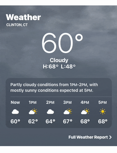
One of the hardest components to create was the weather section in my homepage, as all of that required getting a video for the background, designing all these different elements in different font weights, then creating an hourly forecast that users can also scroll through.
Besides the weather component, however, most others came together fairly well, enough that I could reuse them across pages.
But with all my screens then made, it was time to make it an actual prototype.
Making it Flow
Next, I need to start connecting my screens together to make them flow. Luckily, Adobe XD makes that fairly easy, by just clicking on the component you want, then dragging it to where you want it to send users to.
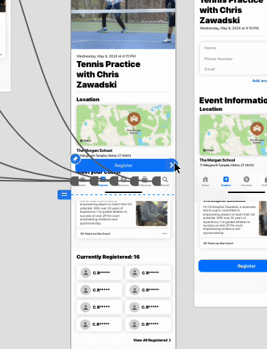
Well that’s easy enough. But what about making things like text or buttons appear on the screen? That’s gonna need a bit more work.
For this like appearing objects or text, we essentially need to duplicate our screens then make the change we want to happen. We then can piece those together with Adobe XD’s prototyping tool, to make it look cohesive.

Easy enough right? Now we just have to do that over and over again for every single flow that we have.
But, with a bunch of time, perseverence and effort, you’re able to make prototypes that look like this.
Overall, I am super happy with how these all came out. I spent some really long hours editing every little detail to ensure it was exactly how I wanted it, with some of it being more worth it than other parts.
I love designing apps like this, though, where you can get full control and create to your heart’s content. It allows you to try anything just to see if it works out, and even if it doesn’t, you can scrap it and start again on something else.
I hope to showcase this project to my Town Manager in the future, and get her opinion about what an app like this can do for a town like Clinton.
If you want to see me walk through all of the flows and discuss them, watch my video here or view it below.
Want to try out the prototype for yourself? Test it here or scroll down below! Start by clicking the myClinton app logo.
Want to read more about the process? Click here or scroll the full document down below!